Ladies and gentleman, I am thrilled to show you the all new Vintage Revivals site!! Cue the confetti, balloons, and marching band!
This little corner of the internet has changed almost as much as my living room over the last 6 years. When I started blogging it was in no way/shape/form like it is now. There wasn’t a million e-courses to teach you what to do, you just made it up as you went.
And there have been some hurrrrrrdles.
And some bad fashion choices.
Why did I use that picture?! I look like I’m going to bite you.
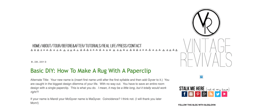
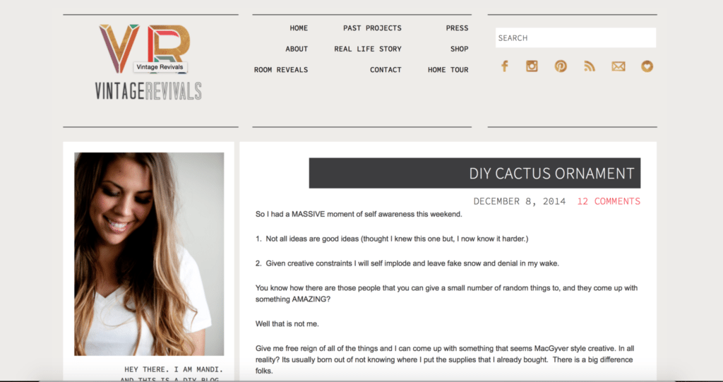
Lets take a walk down memory lane! Which designs do you remember? Thank you Way Back Machine!
But now, after 6 years of tweaking and changing and starting fresh and running through the whole cycle again, and again, I FINALLY have a site that I love. Not just love, but L-O-V-E love. Its sort of mind blowing, how all the info is still here, but 100% cleaner and a MILLION percent easier to find.
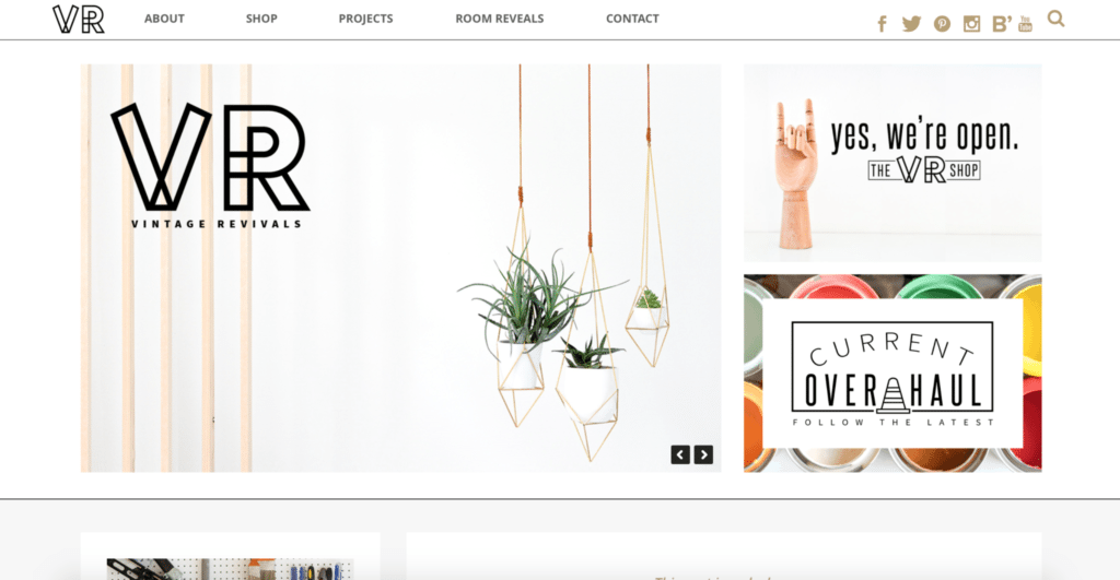
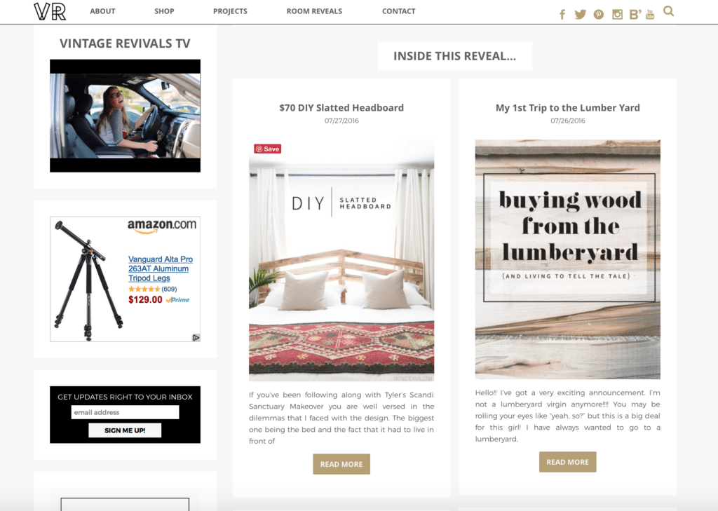
So do ya want a tour? Things look a little different if you are on the actual post vs. the homepage, so you might want to try both to get the full effect! I have taken so much of your feedback into account for this overhaul and I am anxious to hear what you think!
First things first lets talk ads, which I think are the biggest source of everyone’s frustration. I’m always working to find a balance between running a business and keeping things as user friendly as possible. A few years ago sidebar ads were a great way to make $ with your site. Then as time went on, the CPM (which is the amount that an advertiser pays for 1000 impressions of their ad) went down, and the way to combat it was to place more ads, that lets be honest, more ads that are invasive so that they are seen. This is why you may have noticed your favorite blogs who previously didn’t bombard you with ads, start showing more and having them pop up in images or sticking to spots on your screen. Earlier this year, I threw caution to the wind and put up a ton of different ad spots and threw out the conservative approach that I’d been using. I wanted to see if it really did detract from the user experience, and honestly see what type of income was possible. As the year went on, if I got more than 2 emails about a particular spot that was driving people batty we’d analyze it and almost always take it down. Thats why you stopped seeing in post ads, and flyers (I don’t know what they are called) that sort of float onto the middle of your screen, we also reduced the number of in image ads. The result? The extra $$ just wasn’t worth the frustration. So we’ve now got some sidebar ads, and one in post ad. Thats it! We’ll see how it goes!
When I was working with the designer for the new site, I was pretty clear on what I wanted. Simple. Easy to find. I have 6 years of content and needed a way to categorize it to make it accessible. The previous approaches have been to give you as many options as possible to find the same content.
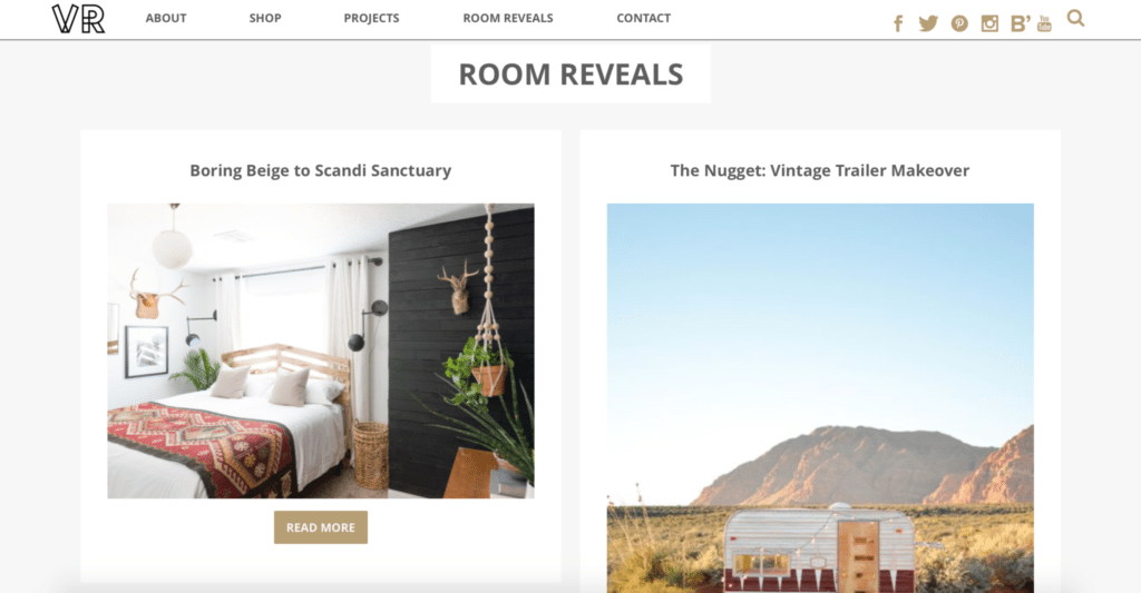
This time we did things differently. There are literally 2 options to click on. Thats it. The Room Reveal and Project tabs at the top of your screen will be you’re bestie if you want to browse old content. If you click on the Room Reveal tab, you’ll see an entire gallery of Room Reveals.
Then when you click into the individual space, it pulls a gallery of all of the projects that are in the space so you can find all of the tutorials in a snap.
If you click on the Project tab, you’ll see a selection of the 6 most recent projects, and if you scroll down they are then broken up by category. So if you want to see all of the Projects that involve Plants, you can just scroll down to that section and click Read More if the project that you want isn’t in the first 6 thumbnails.
You’ll notice if you’re on the home page that there is a button for the Current Overhaul, this links to a page with all of the projects that are for the most recent room makeover, or whatever I’m currently sharing about (right now its Tyler’s Bedroom).
I’ve also added a page called Mandi Recommends that has all of my favorite tools, supplies, and gear so you can shop my garage of sorts.
I love it because its just so simple. There aren’t a million ways to get to the same content. There are literally like 3 places to click. Its not overwhelming, its just easy.
The designer that I used is Ryan from Roundhouse Designs and I recommend him 100%. I don’t do this lightly. I’ve had a handful of companies do a handful of redesigns and I’ve never been as happy as I am with this one. So if you’re looking for a designer, he’s your guy. RYAN I LOVE YOU!
So click around a little and let me know what you think!
The post Check out the ALL NEW Vintage Revivals!! appeared first on Vintage Revivals.
via Mandi at Check out the ALL NEW Vintage Revivals!!


