There have been multiple times during the Merc renovation that I said aloud “MY GOSH. How do normal people do this?!” By normal I mean, not the type of people that think/talk/dream about design all day everyday….ya know, people with hobbies. 😂 There are just so many decisions to make! And they domino, so you can’t screw it up or the whole thing turns out horrible.
Hi. No pressure.
Picking out tile for the Merc has hands down been the hardest thing. Here’s the problem, I love everything. Also I love color. Also pattern 🙌🏼. Which lead me down a rabbit hole of colorful patterns that were super fun and very thrilling. (Did you know that homedepot.com has got some CRAZY cool tile? You can see some of my favorite patterns here!) But I kept coming back to the authentic style of the Merc. It was built in 1928 and the goal was to keep it in that era, and guess what? Crazy patterned tile wasn’t part of the world in Santa Clara UT in 1928. So I’d scrap those ideas and bring myself back to black and white. But then my mind would start to wander again and I’d get caught up in the crazy fun tiles all over again.
What finally broke this vicious cycle was deciding first and foremost what THE MOST important tile related design was. Was it the backsplash in the kitchen? The bathroom floors? The hallways? If you’re in this cycle that seems to never end, use this trick because it totally worked. Ultimately I realized that it was the Merc logo on the floor in the entryway. It was the single most important tile situation in the whole building, something I was unwilling to compromise on. That was an easy decision, and like it does, everything domino’ed from there.
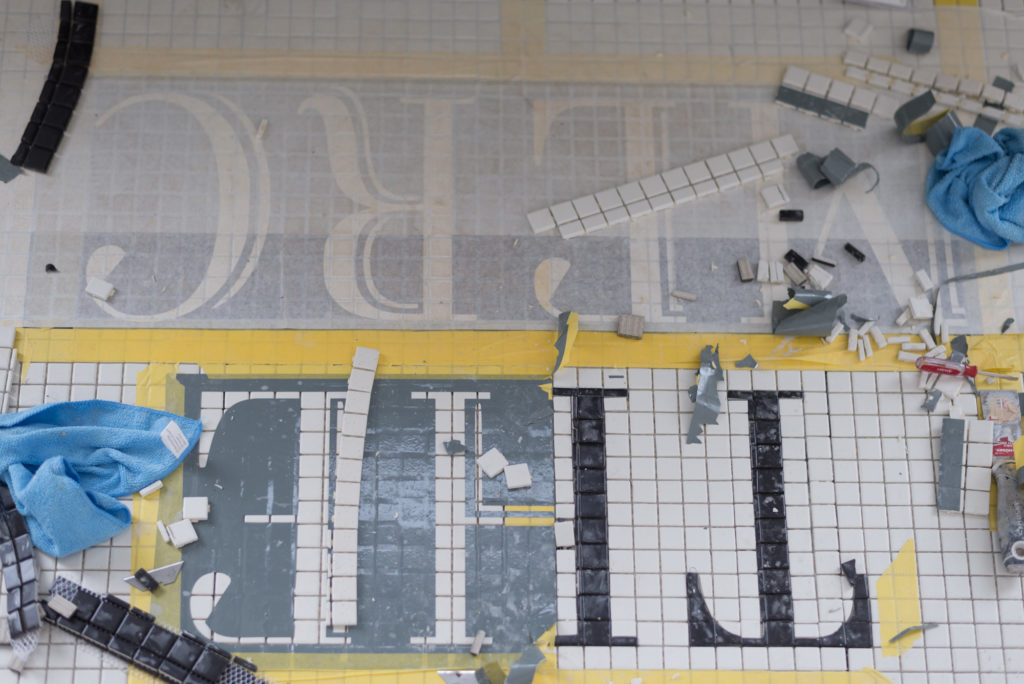
The clarity that I needed to keep the Merc true to her roots came once I stopped looking at allllll of the options and really thought about what was right for the space.
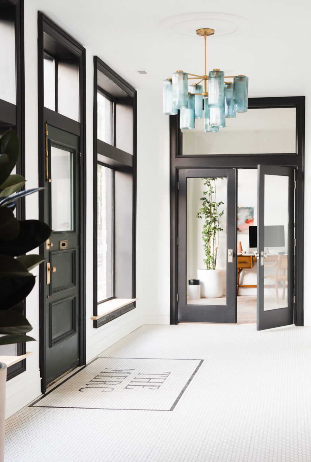
All of our tile (100% of it!) came from homedepot.com. The real question here is have I convinced you yet that Home Depot is the answer to everything?!
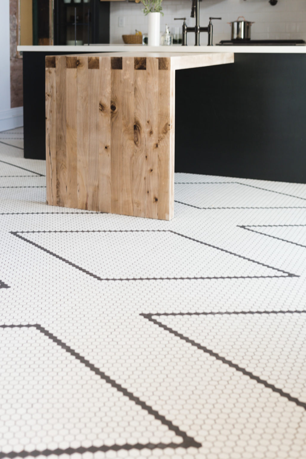
On the floors we ended up with Daltile Keystone in Arctic White. White 1″ Hex tile in the entryway/kitchen/hallways, white 1″ square tile in Ivie’s bathroom and for the Merc logo, and black 4″ matte square tile in the main bathroom. So simple but it left the option for customization wide open.
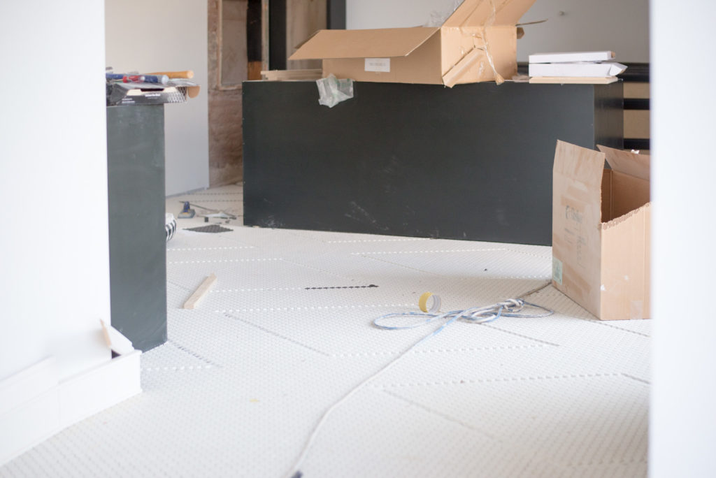
The way I finally was able to scratch that pattern itch was to hand lay contrasting tiles on the kitchen floor. It kept the vintage vibe I wanted but is so freaking impactful I cant even stand it. The kitchen floor is hands down the star of the show at the Merc. And the best part of all, if you can count, you can do this in your house!
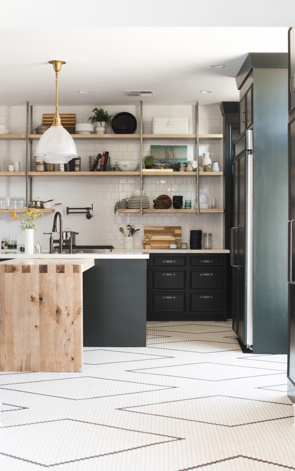
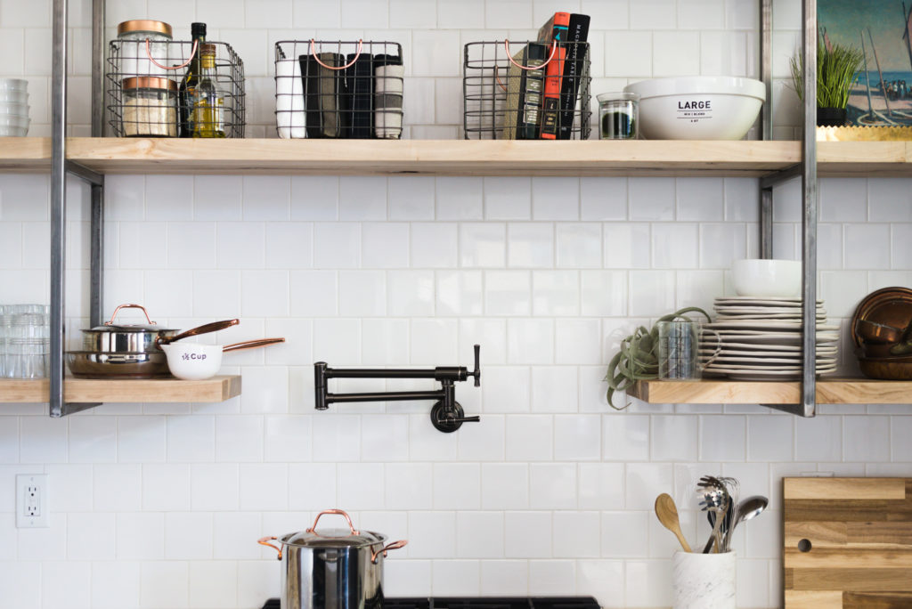
 I decided to use simple 4×4 white square tile from Daltile on the kitchen backsplash. These are in stock at every Home Depot and a wall this size cost less than $500!! One thing that I’ve learned over the years is that color lovers like myself need a simple place to start, that way I can customize to my hearts content. So as contrary as this sounds, if you love color, start with lots and lots of white.
In Ivie’s bathroom I hand laid a border in the white 1″ square tile out of contrasting black tile and it’s just SO good.
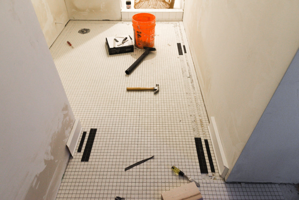
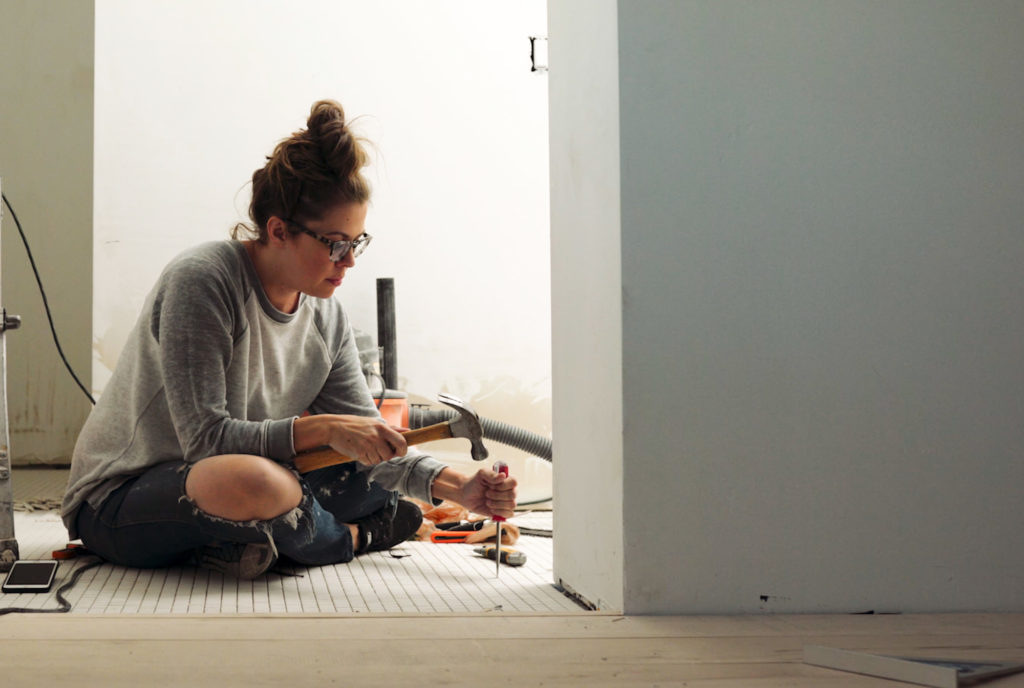 I’ve got some very in-depth tutorials coming for each of these tile projects (including videos!) but I thought it would be fun to show you a little bit of the process first cause honestly, who doesn’t like a good sneak peek!
Check out our latest vlog below!!
The post Deciding on Tile For The Merc (AKA The Hardest Decision Of My Life) appeared first on Vintage Revivals.
via Mandi at Deciding on Tile For The Merc (AKA The Hardest Decision Of My Life)